How to Use DxOMark, the Ultimate Guide to DxOMark
DxOMark is a popular camera rating website that tests a huge number of cameras and lenses and provides their results online to everyone. However, not all photographers know how to get useful data from the site, and this has caused many photographers to denounce DxOMark as useless. Luckily, there is a lot of value to be had if you know where to look, and this guide will teach you exactly how to use DxOMark to learn more about a camera or lens.
Evaluating Cameras
DxOMark’s camera ratings are very comprehensive, with pages for most Nikon, Canon, and Sony cameras, and even many less popular cameras. If you go to their main page for cameras you’ll see a table of all the cameras they’ve reviewed, and you can sort them by name, megapixel count, sensor size, price, launch date, and DxOMark scores.
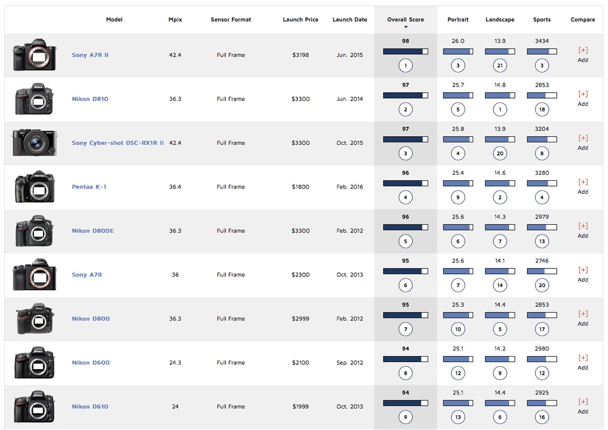
DxOMark provides three aggregate scores for portrait, landscape, and sports, along with an overall score. These aggregate scores are what mislead people - do not assume that just because one camera has a better score that it’s actually better. These scores can give you a rough idea of how a camera performs, but they’re too simplified to be of much more use.
Fortunately DxOMark allows you to view more detailed measurements. If you select a camera, you’ll see a bar of links above the scores - scores, specifications, measurements, and lenses tested.
Scores just brings you to the page with aggregate data, the same as you saw in the table before. It also shows some comparison options with other cameras. The specifications page is a list of specs for the camera - nothing you can’t find elsewhere but handy to have for reference. The measurements page gives the most useful data about the camera - we’ll cover that in depth shortly. And the lenses tested section gives you a list of all the lenses that have been tested with the camera, which is useful if you own the camera and want to see if a lens you want to buy has been tested with it.
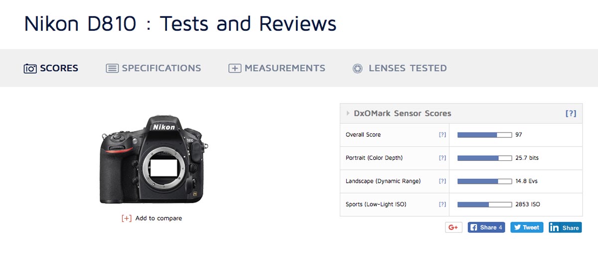
The measurements page is the real meat and potatoes of DxOMark, and this is what people really need to be looking at if they want to get useful information from the site. You’re giving a series of charts, ISO Sensitivity, SNR 18%, Dynamic Range, Tonal Range, Color Sensitivity, Full SNR, Color Response, and Full CS. I’ll cover each metric in the following paragraphs.
ISO Sensitivity
ISO sensitivity is the measurement of the actual ISO the camera’s set to when it’s set to any given value. So if a camera’s set to ISO 3200, but actually only provides ISO 2600, the camera won’t be registering as much light as it should be, and will take a darker photo than a camera with a higher actual ISO value.
Most cameras do tend to have lower true ISO values than advertised, so in practice the difference is rarely noticeable between cameras. The exception is the artificially low values, like cameras that have a base ISO of 100 but can go down to ISO 50 via software. This is simply an ISO 100 image that’s been edited to be darker, and has the same true ISO as a shot at the base ISO. Hence it will usually have a higher true ISO value than you’d expect.
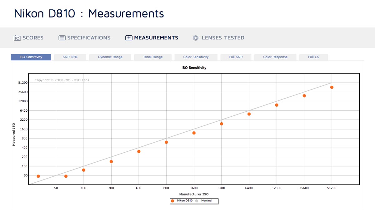
ISO sensitivity isn’t a very important metric - in some cases a camera may have a much truer actual ISO than another and thus have some slight advantage over a camera with less accurate ISO values, but rarely is the difference important or even noticeable.
SNR 18%
SNR 18% is essentially a measure of how noisy an image is at difference ISOs. SNR stands for Signal to Noise Ratio, and 18% is for 18% grey, the shade used for the test subject. The signal is the proper light photons we want to collect, and the noise is random radiation that makes an image look grainy. So a higher SNR will give a cleaner image, whereas lower SNR values mean that an image will be grainy, with loss of colour and detail.
For each test point the exposure is adjusted to account for the change in ISO and retain the same scene brightness. This means that SNR will decrease as ISO values increase, since you’re reducing the amount of light (the signal) without doing anything about random radiation.
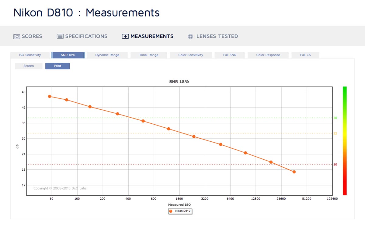
DxOMark has three dotted lines on the graph, a green line, a yellow line, and a red line. Above the green line, photos taken at those ISOs will be relatively free of noise. Under the green line noise will be noticeable. Under the yellow line noise will be quite noticeable, but not catastrophic. And under the red line noise will be dramatic.
DxOMark also gives two choices for measuring SNR - Screen and Print. The default is print, and this is the best option for comparing cameras. Print assumes that the photo has been resized to 8 megapixels and printed at 8"x12" and 300 dpi. This lets you compare cameras without worrying about pixel density, as they’re looking at the final result that you’d get from both.
Screen assumes you’re looking at the photo on a computer at 100% magnification. This puts cameras with more megapixels at a disadvantage, as at 100% magnification you’re looking at a smaller swatch of the sensor and it’s thus collected less light than a 100% section of a lower megapixel sensor. So a 36 MP sensor might be better than a 12 MP sensor in Print mode, but worse in Screen mode just because it’s more zoomed in. But the camera that’s better in Print mode will actually be the better camera in practice - it just gives you the option to zoom in further.
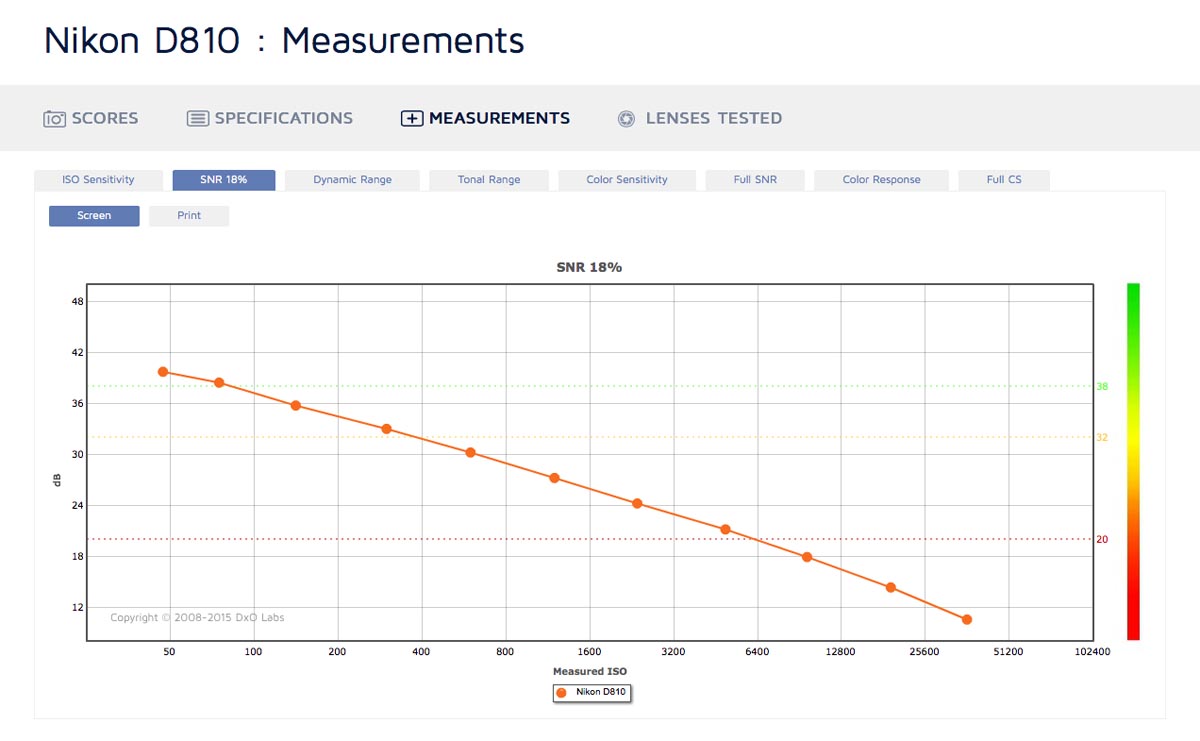
The green, orange, and red dotted lines will generally be less forgiving in Screen mode, since Print mode is down sampled so noise is less evident than in Screen mode. The only exception would be for cameras with less than 8 megapixels, in which case their noise is magnified in Print mode rather than reduced.
Dynamic Range
Dynamic range is the measure of how many stops of light are between the brightest white and the blackest black in an image. In effect, it’s a measure of how much contrast the camera can record in a scene without losing the detail to crushed shadows and blown highlights. DxOMark lists it in Ev, which stands for Exposure Value, and is equivalent to stops. DxOMark measures it as the range between clipped highlights and shadows that have an SNR of 1 (50% random noise), which in practice is effectively the difference between black and white. Don't worry too much about the specifics - other sites measure DR in a different range, but with any measurement all you really need to know is that higher DR values give you more freedom to capture scenes with more contrast.
Again, dynamic range decreases as ISO values increase. DxOMark also has green, yellow, and red dotted lines for varying levels of acceptability. However, I find they’re less useful than the lines in SNR 18%, since dynamic range needs vary greatly depending on what you’re shooting. A shot of someone backlit by a sunset may require 14 stops of dynamic range, whereas a photo of someone on a cloudy day might only require 8.
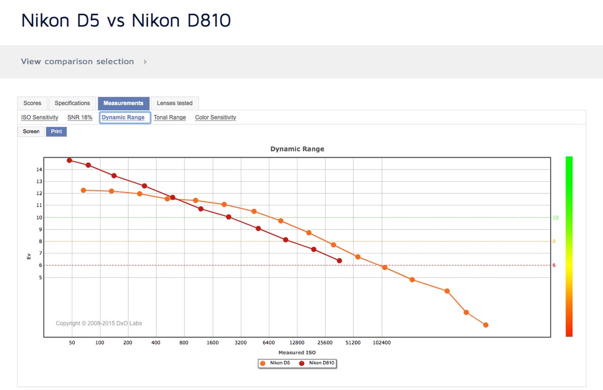
Dynamic range is a big component of image quality, especially at higher ISOs. Perhaps as important as SNR 18% in many cases (though they are closely linked). It’s not rare for a camera to specialize at one end of the ISO spectrum - for example having extremely high dynamic range at low ISOs but not so good dynamic range at high ISOs, or having unimpressive dynamic range at low ISOs but unusually high dynamic range at high ISOs. For example, the D810 has a dynamic range of 14.36 Ev at ISO, whereas the Nikon D5 only has a DR of 12.26 Ev. But at ISO 12800, the D5 has a DR of 9.71 Ev, and the D810 has a DR of only 8.13 Ev. So the D810 is a better camera at low ISOs, whereas the D5 has a big edge at high ISO. The aggregate scores don’t reflect anything but the score at base ISO, so it’s important to check the actual measurements when investigating dynamic range.
Tonal Range
Tonal range is kind of a combination of the dynamic range and SNR 18% scores, but on some occasions might give unique and interesting data. It’s measured as the bit depth of a file required to store all the data in an image at that ISO.
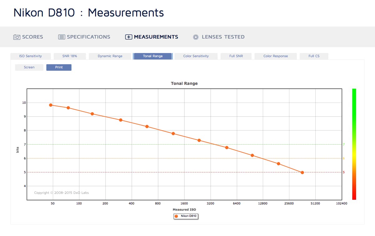
As with the other measurements, there are green, yellow, and red dotted lines denoting levels of acceptability, and you have Print and Screen modes that function the same as in other graphs.
I wish I could write more about this, but to be honest I don’t understand it well enough to do the subject justice. It’s a less intuitive metric for photographers than the others, but is does give you a decent measure of overall image quality at different ISO values. The important thing to know is that the higher the bit depth, the more information is being recorded, thus the better the image quality.
Color Sensitivity
Color sensitivity is similar to tonal range, but with colours. It measures the number of bits required to encode all the colours that are distinguishable in an image. As noise degrades the image you lose colour data, so color sensitivity is highest at lower ISOs.
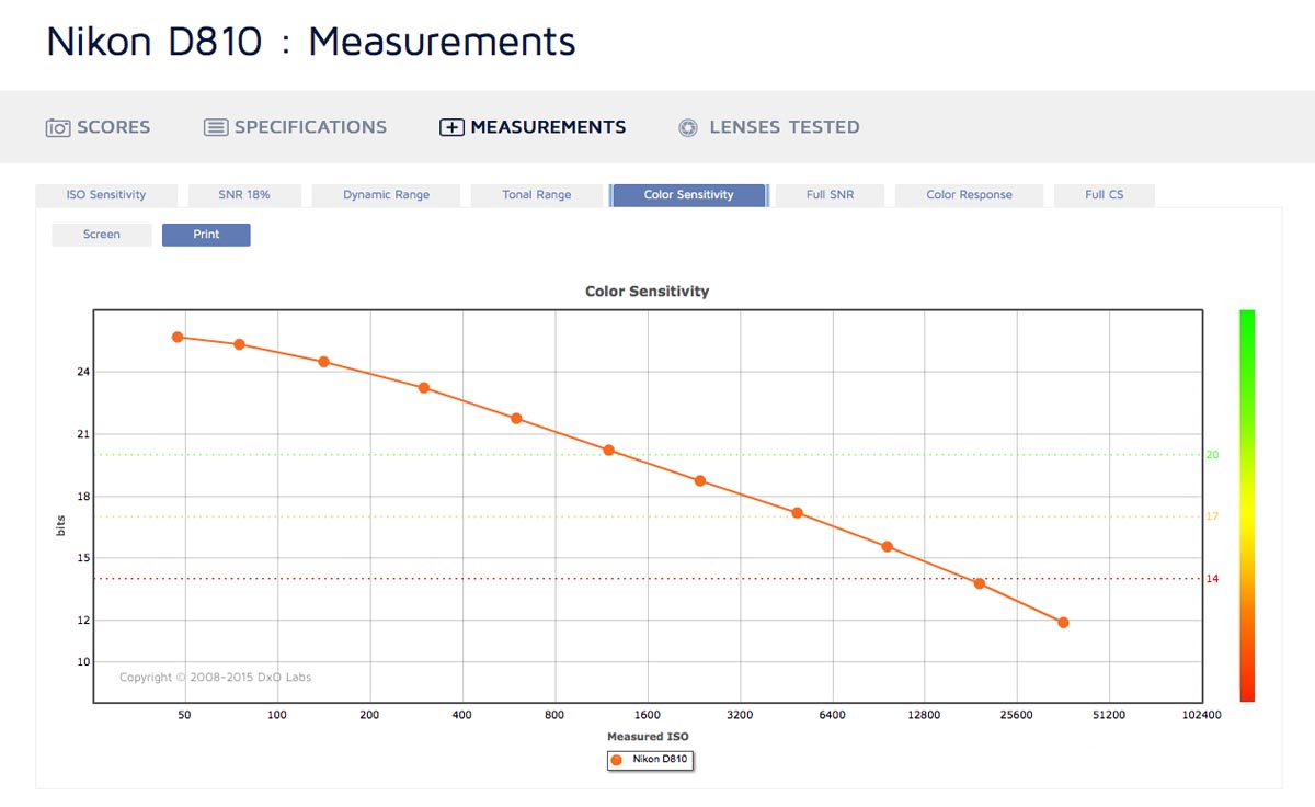
While this is another measurement that’s not so easy to grasp as photographers, if you’ve played older games you’ll know about 8 bit colour and how limited that colour palette is. As we increase the number of bits, we get more colours, and thus images that are truer to life. The difference between, say, 20 and 24 bits isn’t nearly as noticeable as the difference between 8 and 12 bits, but better color sensitivity scores are advantageous, especially if you’re working in wider colour gamuts like AdobeRGB instead of sRGB.
Full SNR
(Note: Full SNR, Color Response, and Full CS are currently only visible when viewing a single camera, not when comparing multiple cameras on the same page.)
Full SNR gives you the SNR values for colour targets ranging from black to white, rather than just 18% grey. With darker subjects, less light is reflected to the sensor so the signal is reduced and noise is more visible. Hence the SNR decreases.
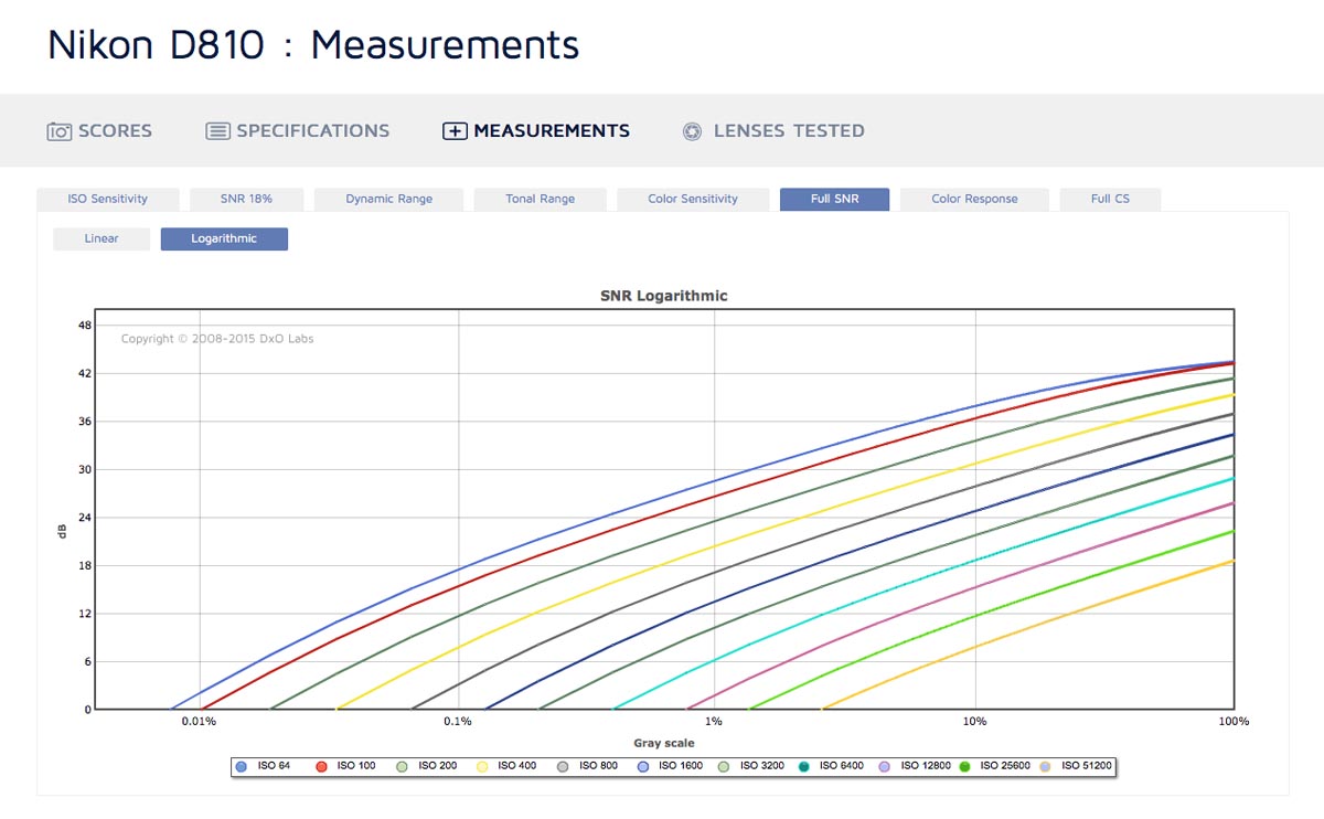
The difference in SNR levels is minimal from around 18% to 100% (18% grey to pure white), so DxOMark defaults to a logarithmic view that better shows the difference in darker scenes. However, you can switch to a linear plot if you prefer.
Each ISO value is represented as a line. Where it touches the x-axis on the bottom left is where it is no longer able to collect anything but noise, as the target’s too dark for the dynamic range. So at base ISO it might be at 0.01% (almost pure black), whereas at ISO 12800 it might be at 1% (very dark grey).
Where the ISO line intersects the y-axis on the right is the maximum SNR for that ISO, when the subject is pure white. This is a best case scenario, with the camera receiving the largest possible signal (reflected light) and noise being thus less noticeable.
The SNR 18% measurement discussed earlier is generally a fine overview, but it’s nice to have the additional data for other shades, especially if you shoot a lot of very dark or very bright subjects, like black furniture or high key baby portraits.
Note that the Full SNR is measured in "Screen" mode, ie. it's at the pixel level and not normalized to any standard output sizes. This means that cameras with more megapixels will be at a disadvantage, so when comparing cameras keep that in mind. (Thanks to /u/sergesr on Reddit for pointing that out.)
Color Response
Color response is really technical, and of very limited use to photographers. It might be cool to look into, but realistically it’s not a metric you’ll use when comparing cameras. With that said, hat’s off to DxOMark for providing the data.
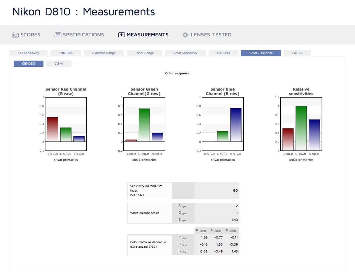
Basically, it lets you see how the different colour channels in the sensor respond to light, and what percent of each colour they pick up. This is then used by the camera to determine the correct colours for the final image.
There’s more to it than that, but that’s about as far as my understanding goes - unless you’re an electrical engineer it’s very unlikely that those numbers will have much meaning to you. Any visible effect that the color response has will likely be reflected in the other graphs, so for comparing cameras I'd focus on the SNR, dynamic range, tonal range, and color sensitivity graphs.
Full CS
Standing for Full Color Sensitivity, DxOMark again expands on an earlier category. There are a lot of very technical terms in there, but you can get the gist of it without too much difficulty.
You select an ISO value, and it shows what are basically margins of error around different colours on the colour spectrum at that ISO. So due to noise at higher ISOs, the true colour of the subject could be represented incorrectly, and this let’s you see both the degree of incorrectness and also compare that degree to different colours.
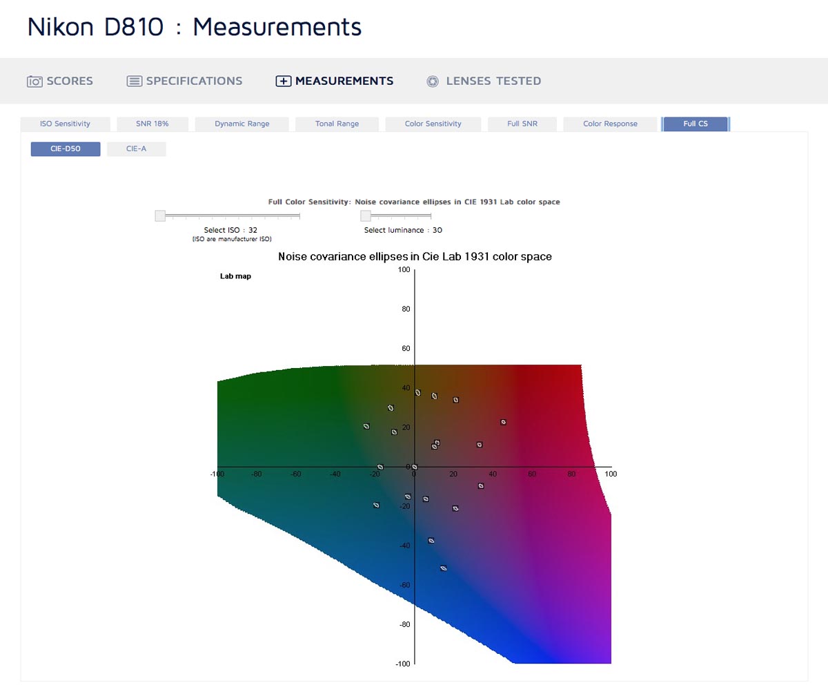
For example, looking at results for the D810, there are big error ellipses around yellow and green colours, and smaller error ellipses around blue and red colours. So you could expect it to deliver more accurate blues and reds at high ISO, and less accurate greens and yellows.
You can also select different luminosities - at higher luminance there’s less error.
Comparing Cameras
Now that we know what metrics DxOMark provides and how to use them, there’s a convenient way to compare two or three cameras at once, and view their results on the same graph.
Visiting the DxOMark Camera Sensor In-Depth Comparison Tool gives you a list of thumbnails of different cameras with information about them. If the camera has "TESTED" written below the thumbnail, DxOMark has taken the measurements for it, and by clicking "Select" beside that you add it to your comparison selection.
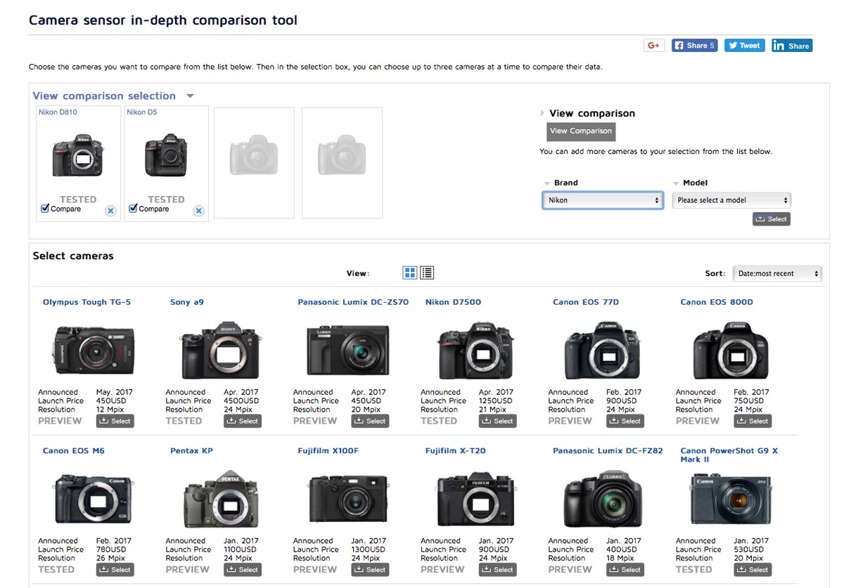
Clicking "View comparison selection" above the table of cameras creates a drop-down that shows the currently selected cameras, and drop-down lists to select other cameras. Those lists are more convenient than the thumbnails, since you can select the brand of camera and more quickly find what you want. Cameras are generally listed in order of release, with newer cameras near the bottom.
Note that that list doesn’t tell you if the camera’s been tested, but if you select a camera it will add itself to the comparison selection and you’ll see either the "TESTED" or "PREVIEW" label. "PREVIEW" cameras only have specs, not measurements.
You can add numerous cameras to the comparison selection at a time, but only view the measurements of at most three at one time. Select the cameras you want to compare by clicking the "Compare" checkbox under cameras in your comparison selection, and then click "View Comparison" on the right to see the camera scores, specs, measurements, and lenses tested listed together.
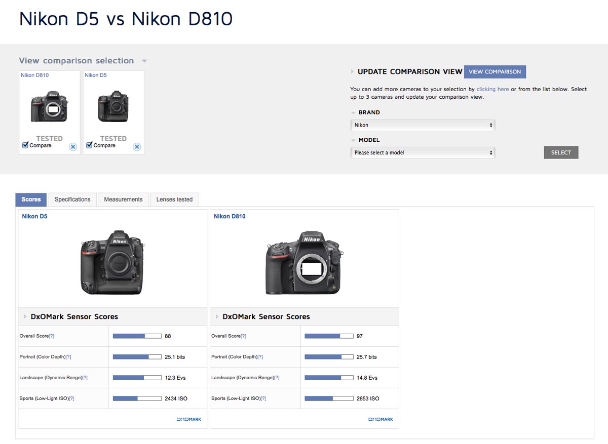
Now when you view the measurements, the graphs for each camera will be overlaid onto one plot so you can easily see where one camera’s better than the other, or at what ISO there’s a crossover in which is best. The more complicated Full SNR, Color Response, and Full CS graphs are not available in this view, but the others are plenty of information for any photographer, and are the most understandable anyway. SNR 18% and Dynamic Range in particular tend to be the most important factors.
Evaluating Lenses
DxOMark is arguably even more useful for comparing lenses than it is for comparing cameras. However, it is important to note that they do not test multiple copies of the lenses, so there may be some outliers. Always compare their results to multiple reviews if possible to get the most accurate impression of a lens, just in case one person got a good or bad copy.
Like with cameras, you can view the lens database and select lenses from it to view them individually. There are a variety of filtering options, or you can just search "[lens name] dxomark" in Google and that’s often faster.
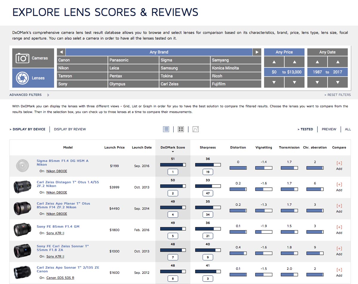
When you select a lens, you’ll have a drop-down list of cameras that the lens has been tested on. If you want to compare the lens on the most taxing body, choose whatever camera has the most megapixels, ideally without an AA filter. A crop sensor camera with sufficient pixel density may be the best choice for taxing the center resolution, but for edge performance you want to test the lens with a full frame camera (unless it’s a crop sensor lens).
If you want to see how well the lens would perform for you, it may also make sense to choose your camera from the list, or the closest to it if yours isn’t on the list. For example, if you have a Nikon D5500, but the lens hasn’t been tested with your camera, maybe try and choose the D5300 or D5600 since they have very similar sensors to the D5500.
Like with cameras, the lens selection provides several tabs - scores, specifications, measurements, and tested with.
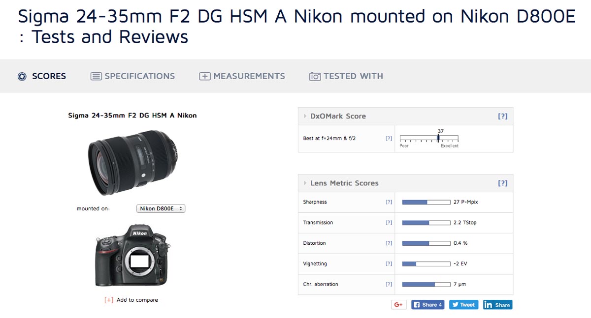
Scores give you very basic data - maximum sharpness (rated in Perceptual Megapixels), maximum transmission (in T-Stops), average distortion (in percent), maximum vignetting (in Ev), and maximum chromatic aberration (in micrometers).
This data is actually somewhat useful. Perceptual megapixels are an interesting unit - it’s very intuitive. If a lens has a score of 20 perceptual megapixels, that means it’s equivalent to a theoretically perfect lens on a theoretically perfect 20 megapixel camera. If it scores 20 P-MPix on a 24MP camera, that means it’s a pretty good combination - it’s resolving almost all of the detail possible. If it resolves 20 P-MPix on a 50MP camera, that’s a lot less impressive.
Cameras with AA filters will have lower sharpness scores than cameras without AA filters, and AA filters also vary in strength, so that’s why it’s most fair to evaluate lenses on the camera with the most megapixels and no AA filter, unless you’re specifically looking for performance on your camera body.
Note that the sharpness value given in the scores section is the maximum sharpness - it could be at any focal length or aperture. A lens might be terrible wide open but very sharp stopped down, or great on the wide end but soft when zoomed in. So that’s where the measurements come in handy.
Same goes for the other scores - at different focal lengths and apertures a lens will have different amounts of vignetting, distortion, transmission, and chromatic aberration. So the scores give best and worst case scenarios - you need to look at the measurements for a more complete assessment.
In the measurements tab, you get the graphs for the DxOMark Score Map, Sharpness, Transmission, Distortion, Vignetting, and Chromatic Aberration.
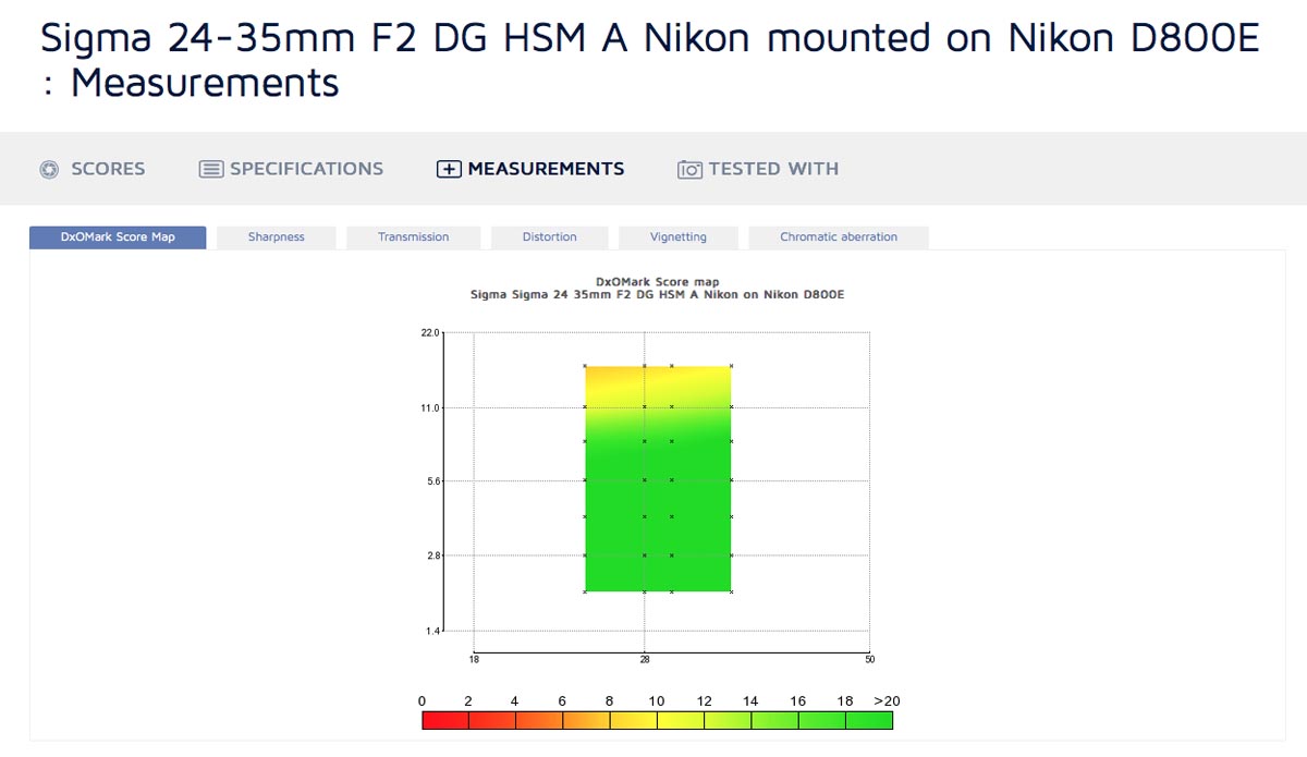
DxOMark Score Map
This is the least useful metric. It shows the aggregate score at each focal length and aperture on a heat map style graph, with green being good and red bad. Unfortunately, not only is this using fairly useless aggregate data, it also caps out at a score of 20, and everything above 20 is the same shade of green. Most lenses are able to exceed this, at least from f1.8 to f11. So you don’t really get much from this, unless the lens is really bad or it’s being tested on a camera with low resolution.
Sharpness
Sharpness is the metric photographers really care about, and DxOMark gives us a lot of data to work with.
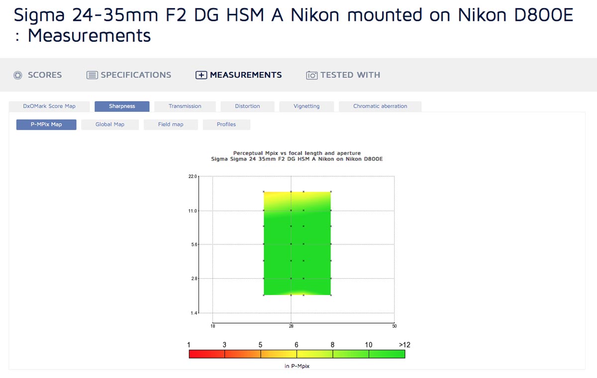
Firstly, they give us a P-MPix map. Mostly useless, since it caps out at 12 perceptual megapixels. This means a large portion of the graph is the same shade of green, and you don’t know if that means it’s resolving 12 P-MPix or 40.
The global map is pretty similar, it caps out at 80% of the possible resolution of the camera. Better than P-MPix, but not by much. It does let you select different areas of the frame to look at though, so you can check the edges in a fairly intuitive way.
The field map is better yet. Again it caps at 80%, but it gives you a view of the whole frame and a selection of focal lengths and apertures. If the lens has weaknesses and isn’t resolving above 80% somewhere, it’s very visible and you’ll get a clear view of where in the frame the lens is weakest at each focal length, and how it’s affected by stopping down.
The profiles section is where you get the best information when comparing lenses though. The field map is good for a visual overview, but it’s hard to compare one shade of yellowish-green to another by sight alone. The profiles map sharpness as a line, allowing you to easily see if one lens is sharper than another since the line will be higher. Two lines are shown, one for horizontal position in the frame and one for vertical position. On the left, they’re at field position 0% - the center of the frame. On the right they’re at field position 100% - the respective extreme edge.
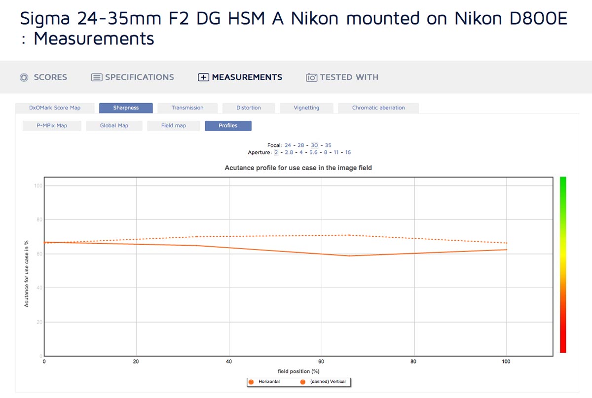
This is most useful in comparing lenses - if you’re just looking at one lens it’s a bit hard to interpret and the field map is better. But when you use the lens comparison tool and view two lenses on the same profiles plot it allows you to clearly view where one lens is sharper than the other.
Transmission
Transmission is measured in T-Stops. T-Stops are essentially perfect F-Stops. For example, a T-Stop of t2.2 is equivalent to an F-Stop of f2.2 that doesn’t lose any light to reflections in the glass. No lens is that perfect, so the T-Stop is always a little higher than the F-Stop. If the T-Stop is much higher than the F-Stop, you may notice that images from the lens are darker than you’d expect.
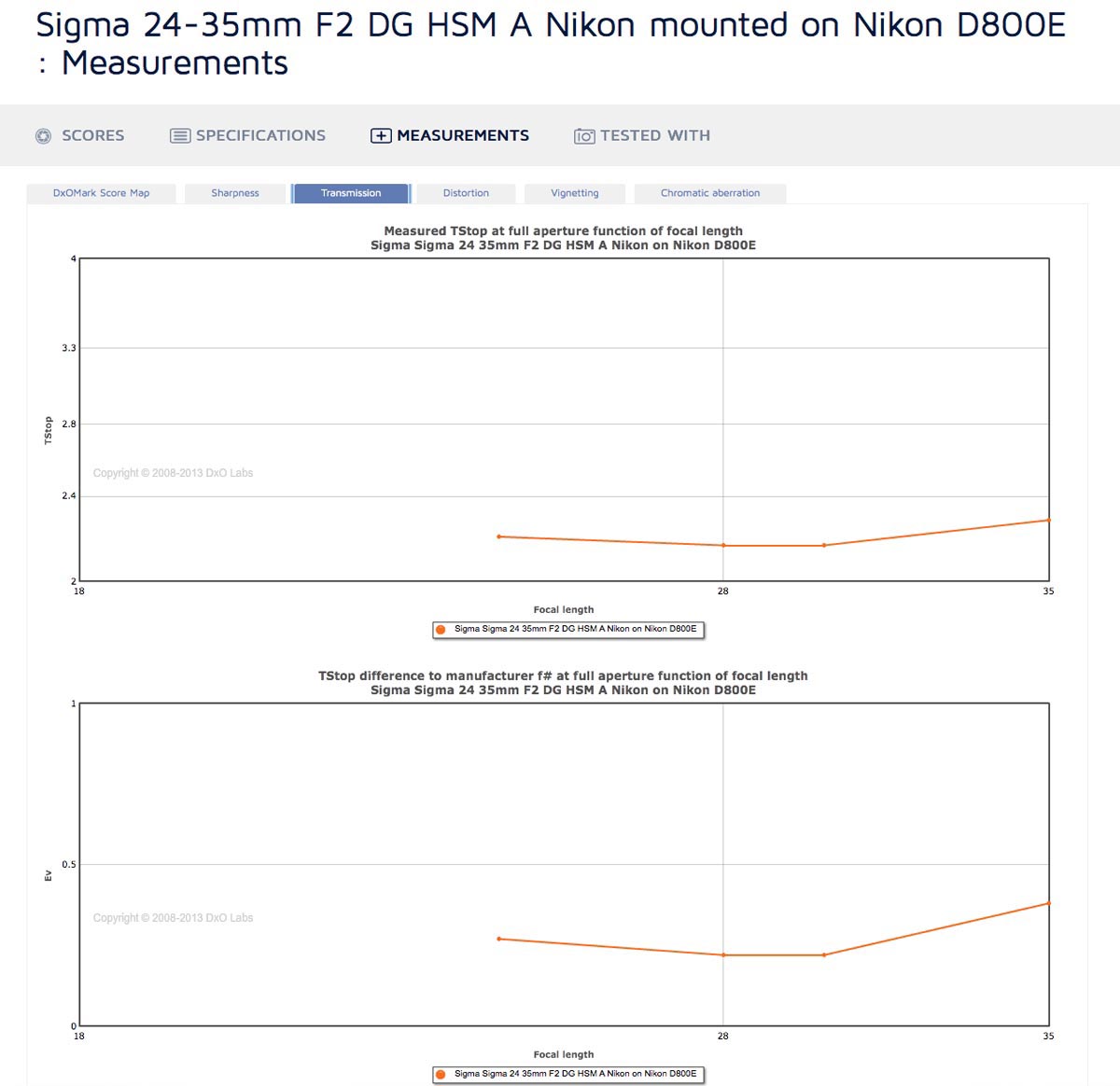
Transmission is only measured at maximum aperture, but it’s still a useful metric as it does vary at different focal lengths in zoom lenses. DxOMark provides two graphs - one of the T-Stop at each focal length, and one of the difference in light transmission to the listed F-Stop at each focal length, measured in Ev. The latter is useful for variable aperture zooms, as it equalizes for the change in aperture so you can more readily compare focal lengths.
Distortion
Distortion the measure of how straight lines get rendered as curved by the lens. A perfect lens would render straight lines as straight, but most lenses have a little distortion that cause the lines to bulge a bit.
The maximum plot shows the maximum distortion in percent at a variety of focal lengths, which is useful for a quick overview.
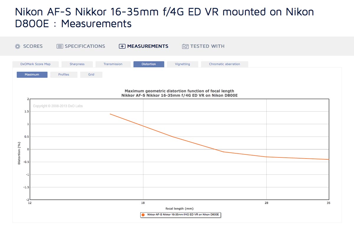
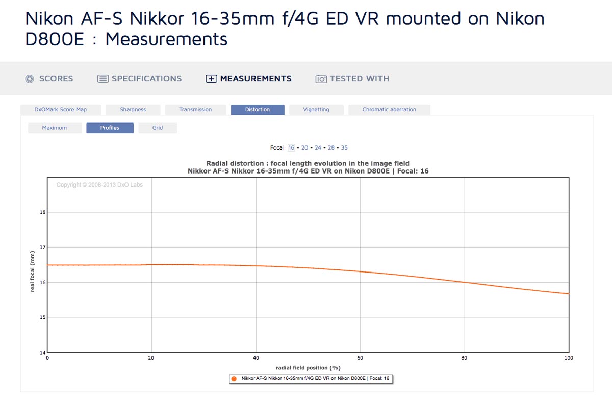
The profiles view shows distortion measured as the focal length across the frame, and you can select different focal lengths. For example, the Nikon 16-35 f4 VR at 16mm is really about 16.5mm in the center and 15.7mm on the edges, so there’s clearly some distortion. At 24mm, it’s 23.8mm at the center and 24mm at the edge, so distortion is negligible. This is a good way to compare lenses if they’re of the same focal length - differences in distortion will show up clearly on the plot. You can also view if a lens isn’t actually the advertised focal length for example that Nikon 16-35 is really more like a 32.7mm lens at 35mm. Not a big deal, but good to know.
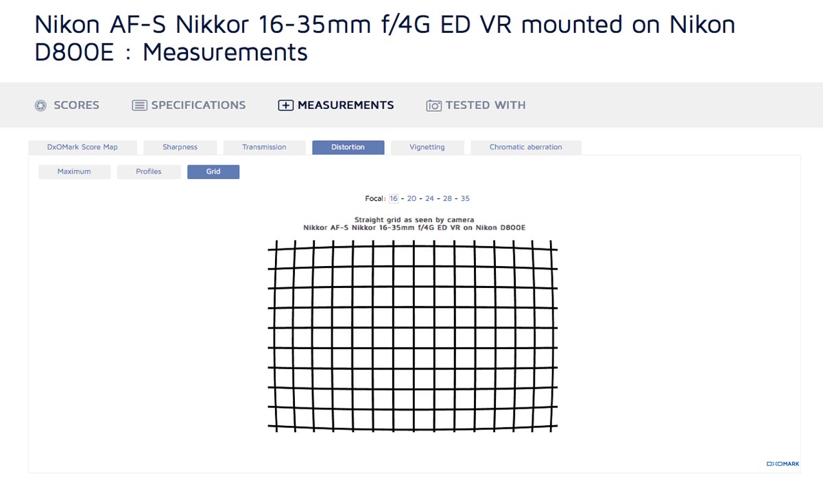
The grid view lets you choose a focal length and shows a grid with the equivalent distortion applied. Very handy for a quick visual overview of how sever a lens’s distortion is.
Vignetting
Vignetting is a measure of how much darker parts of the frame are from the center, measured in Ev. For example, a lens may have a T-Stop of t1.4 in the center, but the corners may be 2 Ev darker, and thus it’s t2.8 in the corners (2 Ev equals 2 T-Stops).
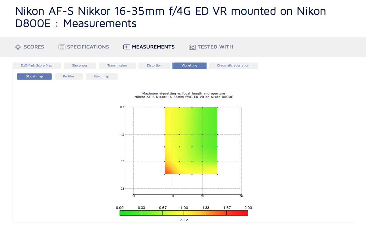
The global map is somewhat useful here - you can easily see at what focal lengths the vignetting is worst. For primes it’s less useful, since vignetting’s always worst at wide apertures, and there’s no focal length variable to look at instead.
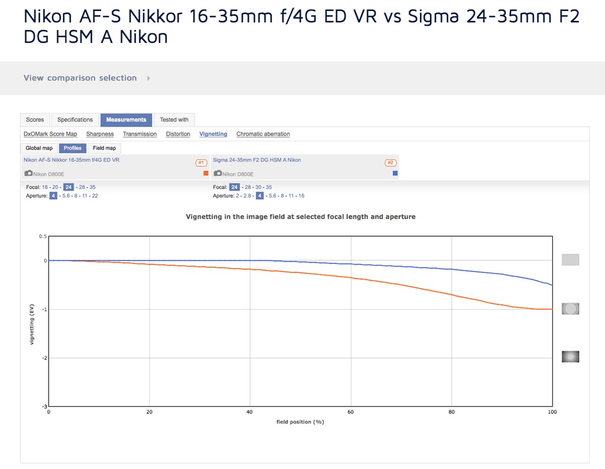
The profiles view lets you select the focal length and aperture, and plots a line showing the vignetting in Ev at the center of the frame to the edges. This is the most useful view for comparing lenses, since it’s easy to see how much higher one line is from another.
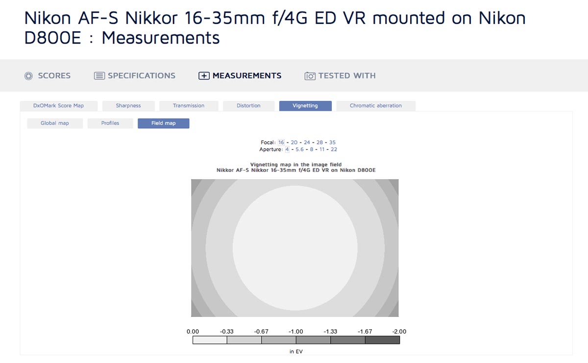
The field map also lets you select different apertures and focal lengths, but gives a more visual representation of the vignetting. Darker bands mean more vignetting, so it’s very intuitive and you can instantly grasp how much vignetting there will be at any given setting.
Chromatic Aberration
Chromatic Aberration, or CA, is that colour fringing you get when wavelengths of light aren’t focused to the same place on the sensor. This is especially visible on high contrast edges.
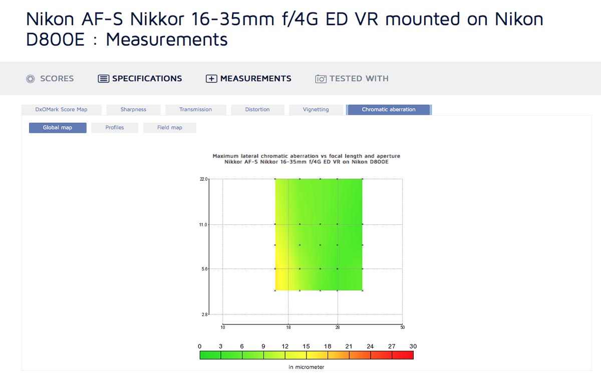
The global map does a great job of visualizing CA, measured in micrometers. A camera’s pixel is usually about 4 micrometers to 8 micrometers, depending on sensor size and megapixel count. So green portions on the map, which correspond to under 9 micrometers of CA, are pretty good - at most two pixels of CA.
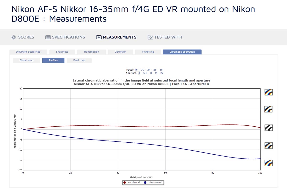
The profiles view gives an even more in depth look at things. It’s a bit confusing at first because there are two lines - one for the red channel and one for the blue channel. One channel might have minimal CA while other might have extreme CA - this is still bad. The left side of the graph is the center of the frame, while the right is the edges. Sometimes CA is worse in the edges than the rest of the frame, sometimes it’s worse in the midframe. You could use this information to maximize image quality when shooting high contrast subjects if you knew the areas to be careful with. CA typically decreases as you stop down, and DxOMark lets you select a variety of focal lengths and apertures to look at.
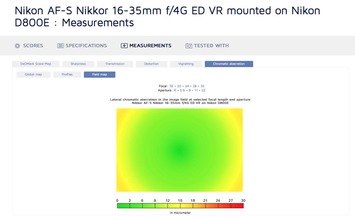
The field map gives a nice visual reference, but it doesn’t give the same detail as the profiles view. It is decent for a quick overview of different focal lengths and apertures though, and the heat map style is more intuitive than the profiles view.
Comparing Lenses
As with cameras, DxOMark offers a DxOMark Lens In-Depth Comparison Tool. Similar to the camera tool, you can choose the lens from a selection of thumbnails, or click the "View comparison selection" button to view drop down menus that let you select the brand of the lens you want to compare and the model. As with cameras, you can only compare three lenses at once, though you can have many more in the comparison selection for future comparisons. As with cameras, untested lenses have a "PREVIEW" label and tested lenses have a "TESTED" label.
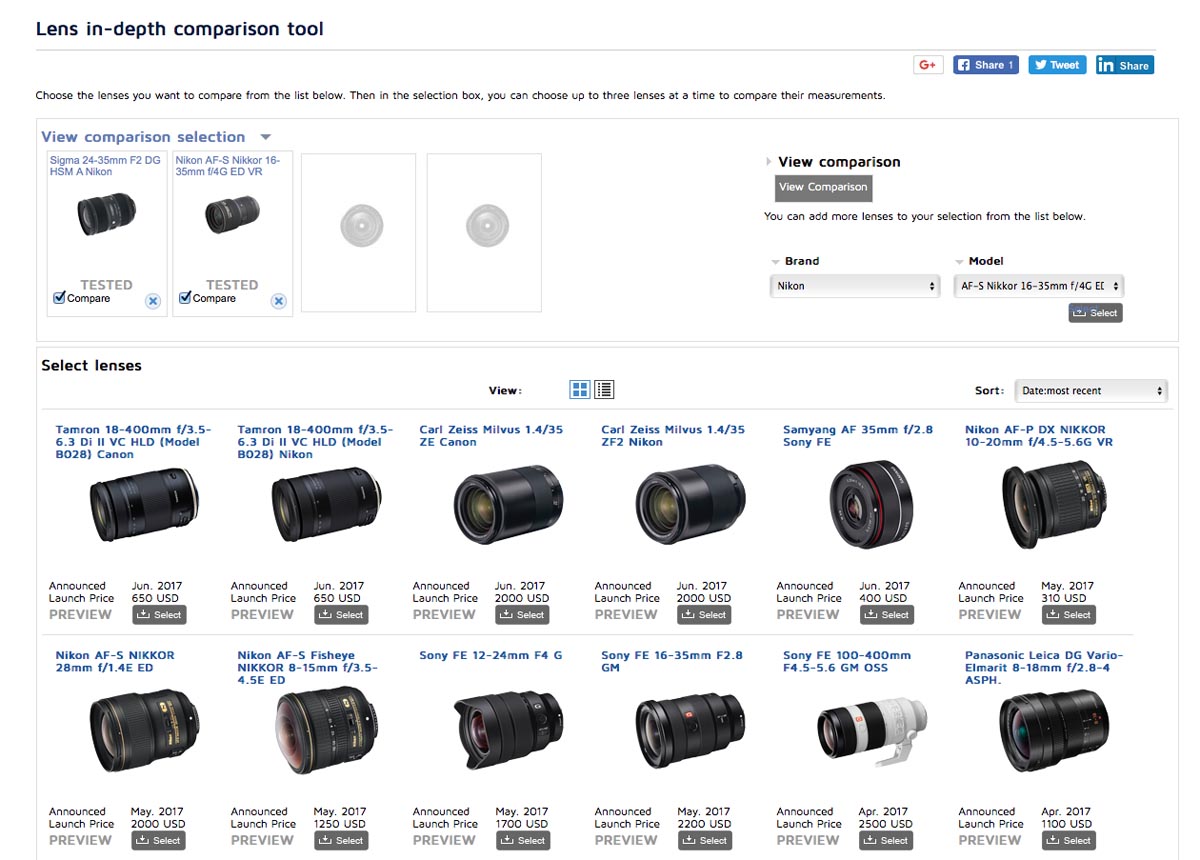
Once you’ve checked off the lenses you want to compare, hitting the "View Comparison" button will take you to the comparison. On the scores page you can choose the camera each lens was tested on - I recommend choosing the same camera for both lenses if possible, for the fairest comparison. You will have to wait for the page to refresh before choosing the camera for the next lens, so be sure the correct cameras are chosen before looking at the results.
In the measurements section, profiles are plotted on the same graph for all lenses, whereas maps are placed adjacent to each other. This makes profiles the most useful view for comparing lenses.
Conclusion
DxOMark is a great tool if you know how to access and interpret their results, so hopefully this guide has helped you find useful information about the lenses and cameras you’re interested in. If you enjoyed this guide, be sure to sign up to the Unlock Creative Photography email list - not only will you be the first to know about more great content like this, you’ll also get my exclusive guide to learning photography faster. Thanks to tools like DxOMark and other online resources, improving your photography is easier than ever. In the guide I’ll share more tools and techniques to help you become a great photographer, and you’ll also automatically get any updates to the guide or new free guides in the future.
Lauchlan Toal is the creator of UnlockCreativePhotography.com, and a Halifax based food photographer. Outside of food photography, he enjoys most genres, finding fun in any kind of photography challenge.